Data Dashboards UX — Design Patterns & Benchmarking
Discover the best Data Dashboards UX design practices from our in-depth benchmarking.
Introduction
Generating and managing large amounts of data is becoming exponentially easier with the advancement of technology.
The challenge lies not in gathering the data but in deriving meaningful insights from it and making appropriate decisions based on those insights.
Organisations must determine how to leverage data to their advantage, in order to make well-informed decisions and take the necessary steps to ensure secure & accurate results. Working with valuable data will empower the teams to make well-calculated decisions, leading to increased efficiency and productivity.
Data dashboards that allow high levels of customisation are essential in this process. By enabling people to visualise and analyse data with certain degrees of flexibility, dashboards can unlock new perspectives and empower teams to analyse their data from multiple angles.
We, Creative Navy, use data dashboards to manage our projects and track progress in our day-to-day agency work. In our product research, we’ve encountered dashboards aimed at various industries and technical expertise levels — from multi-purpose, highly customisable software like Grafana to complex SEO platforms like Semrush, to template-based tools like Looker Studio (owned by Google).
Creative Navy has collected some of the best examples, but hasn't shied away from anything that might not work or would be worth improving in these data visualisation tools.
Data Dashboards Benchmarking
Want your Data Dashboard solution benchmarked? Contact us.
Grafana
✅ Pros
Grafana is an open-source analytics and visualisation web app that provides a free test environment with no time limitations and no sign-up requirement. Users can simply enter the sandbox mode and start playing around with test data.
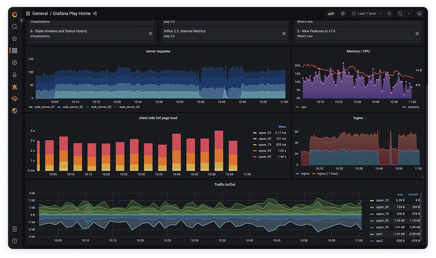
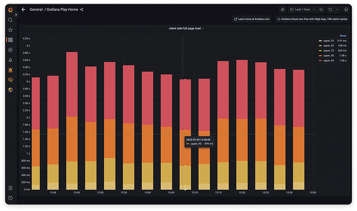
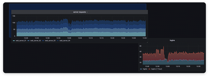
The layout consists of highly customisable widgets. Each widget can be expanded to full-screen mode, so the users can analyse, annotate and edit a particular chart as they wish.
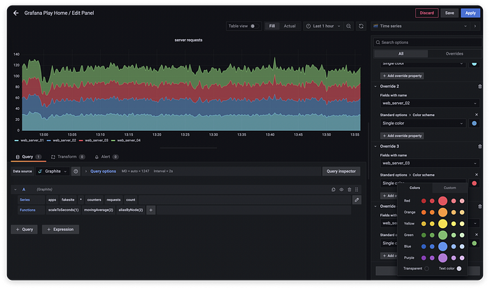
By selecting the "Edit" mode, users can modify any widget on their dashboard. The platform provides excellent control over all aspects of the visualisation:
- The look of widgets can be edited via the right-hand panel.
- The dataset can be edited via the bottom panel.
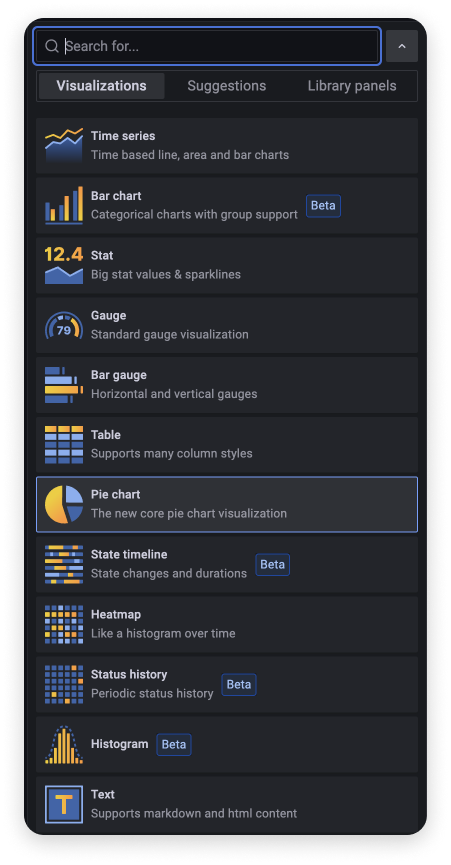
Grafana offers a wide range of visualisations; the “Suggestions” tab filters visualisation types based on the current dataset, to offer applicable solutions. After deciding on a chart type, users are provided with granular control over each visual aspect.
For example, with a stacked bar chart, users can configure: units, tooltip modes, line width, fill opacity, gradient modes, colour schemes, the legend and much more.
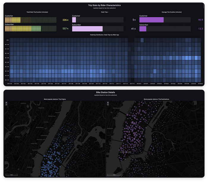
The test environment contains hundreds of example dashboards for varied use cases.
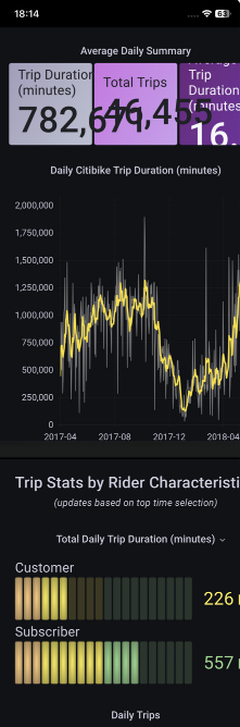
For example, public bike sharing system data can be visualised in multiple ways, based on rider demographic data and location data.
For each dashboard, users can edit the appearance & even the underlying data. Any dashboard can be duplicated and edited as needed.
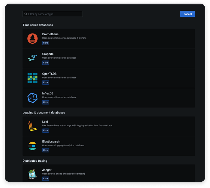
Data can be imported from a whole range of databases, to make migration to Grafana seamless.
Grafana also provides an outstanding documentation space, where people can search for and dive into any feature they want to learn. The information architecture is properly indicated in the navigation side panel and “how to” articles are very well structured.
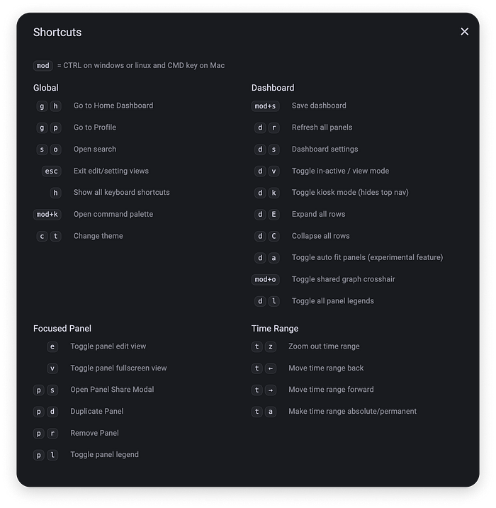
Users have access to an extensive set of keyboard shortcuts; this feature grows in relevance as users learn the basics on a new platform and start looking for ways to optimise their workflow.
❌ Cons
Any widget can be drag-and-dropped to any location on the dashboard, even if the move creates empty spaces.
Too much user freedom can end up being hazardous.
Rearranging elements is great, but enabling users to break the layout could have been avoided by automatically dropping the moved widget only in predetermined slots.
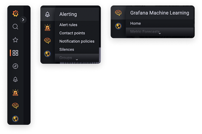
The navigation sidebar is collapsed by default. While this maximises space for data visualisation, it is quite difficult to guess what each menu icon stands for. For example, it seems impossible to guess that the bottom globe symbol stands for “Synthetic Monitoring”.
Secondly, hovering over a menu icon that contains subpages expands a rather awkward drop-down menu, that includes a “scroll down” affordance even when only two subpages are available. A taller maximum height could have been the perfect solution for this drop-down menu so as to avoid the need to scroll down within it.
Grafana widgets are not optimised for mobile resolutions out of the box. We’ve found bugs and other issues that make dashboards almost unusable on small screens, from overlapping font layers to cut-off components. These things might indicate that the smallest break-point is likely aimed at large screen devices.
Kibana
✅ Pros
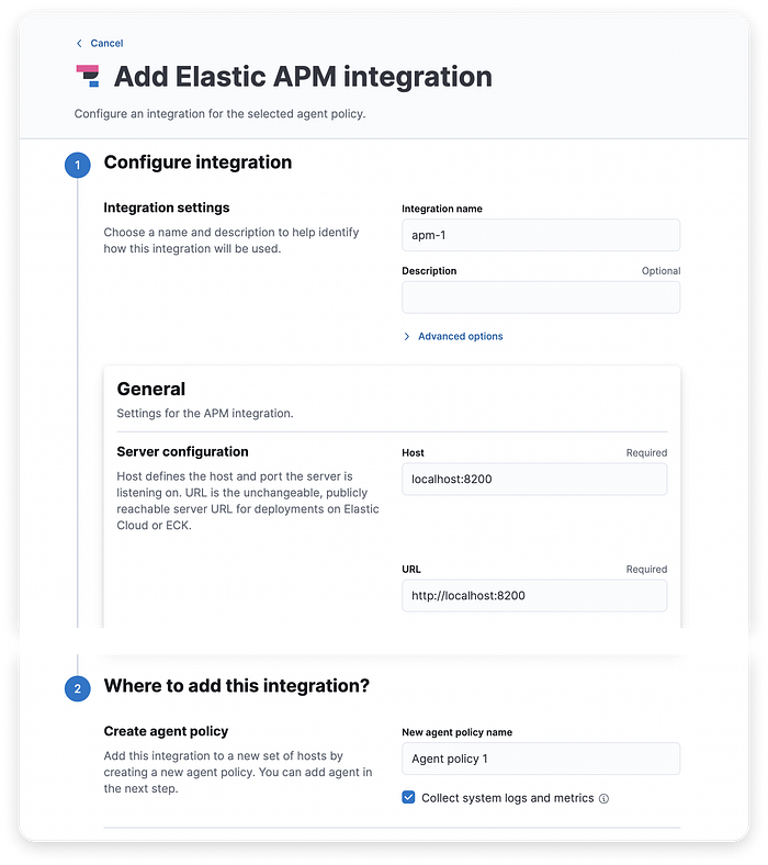
Kibana offers a demo environment, as well as a 14-day trial, on the condition that people fill in a medium-length sign-up form.
Additionally, it provides on-demand webinars. To watch them, visitors only need to provide an email address and select their country. This is a low-friction way of introducing potential users to the core functionality of the platform.

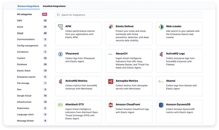
Kibana provides a lot of integrations to collect and analyse data. The number of integrations available is indicated as a tag on the right of each category.
The tappable area includes both category name and tag, which makes it very easy to navigate this area.
The setup experience is guided. The vertical line connecting the steps draws attention to the required user flow when adding an integration. Even though the flow contains a lot of substeps, the layout is optimised to avoid overwhelming new users. We like the fact that advanced options are collapsed by default.
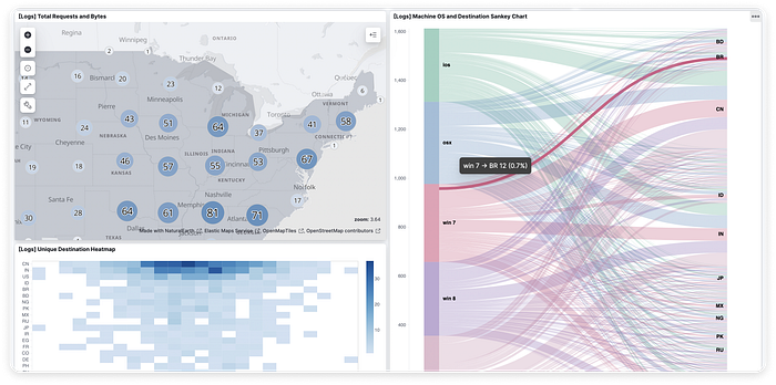
A whole collection of demo dashboards is available for testing. Each dashboard includes customisable widgets. Each chart is highly interactive and users can hover to get more details on the data or click to take actions such as filtering the data they want to view.
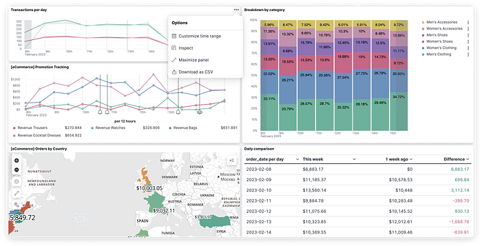
All major types of visualisations are available on the platform. The default colour palette applied to charts contains pleasant pastels, but people can go ahead and customise UI colours if they want.
The mobile web experience is satisfactory: the filter area adapts to continue being usable even on small phones, and each widget adapts responsively to the available screen width.
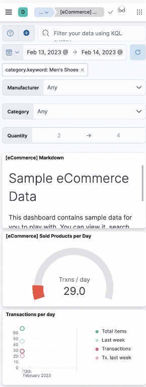
Creating a search query is easy enough on mobile screens, as the drop-down menu adapts to the available screen real estate.
❌ Cons
Navigation is hidden in a hamburger menu that opens on top of the dashboard widgets, as an overlay. Users have no way of pinning the sidebar if they want to see it next to the widgets rather than on top of them.
The “Close sidebar” button is a floating icon at some distance on the right of the sidebar; depending on the visual in the background, it might be difficult to notice, especially since its style does not match the sidebar.

Breadcrumb trails are generally a good idea. This method is a familiar and practical solution for indicating the user’s current location on a platform, as well as enable jumping to higher levels of the information hierarchy. With Kibana, we only wish the UI design of the breadcrumb were refreshed. Simply removing the background shapes below the trail would be a quick and painless improvement.
A walkthrough tooltip is provided as soon as people create an account. However, this seems to be the only step in the “tour”. This small issue could be solved by editing the button label (”Close tip”) or adding at least another guidance step.
Instana
✅ Pros
In addition to a 14-day trial, Instana offers a sandbox environment where its analytics can be tested before importing any real data.
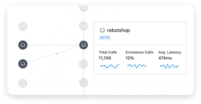
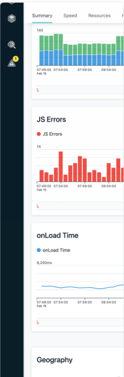
The website analytics dashboard has a good balance between text-only stats and charts. In-page navigation is easy to spot above the statistics area; there’s a slight visual conflict between the filter row and the tab row, but the smaller font and light grey background applied to filters help make them distinctive enough.
Users can navigate into every widget on the dashboard to get more detailed analytics. Every visualisation is highly interactive. A toolbox is provided at the top left of the expanded visual.
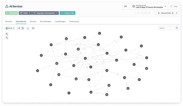
In the Dependencies visualisation, clicking a component automatically lowers the opacity of everything that is not dependent on the selected object and opens a details tooltip. People can dig further into the stats within the tooltip.
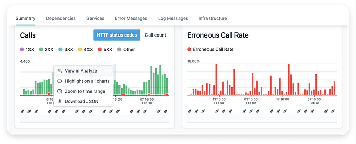
Right-clicking any chart opens a contextual menu. The “Highlight on all charts” feature enables quickly identifying all incidents that occurred at the selected time. “Zoom to time range” also applies to all charts on the dashboard simultaneously.
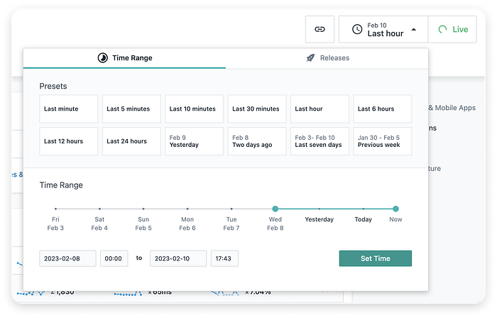
The time range filter provides an atypically large set of options: people can click one of the presets, drag the slider, or enter dates and times manually. This can look slightly overwhelming at first glance, but the layout is clear and the different ways of setting a time range offer users as much control as they might need.
People can build advanced filters, including logical operators. We like that the system suggests commonly used metrics to filter by at the very top of the list — this is a must for inexperienced users.

❌ Cons
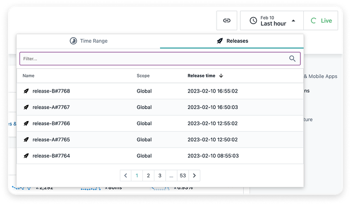
We see no good reason for using the pagination pattern in the Releases filter. Users are unlikely to guess which releases might be displayed on page 3 or later. Scrolling within the Releases tab could be implemented for improved usability. Lazy loading could prevent performance issues.
The hint in the search input field should be “Search” rather than “Filter”; no filter functionality is embedded in that field.
The dashboard is not optimised for mobile web.
On phones, a larger resolution break-point is applied, which makes it necessary to swipe left and right or pinch to zoom out when viewing a graph. In addition, the vertical spacing between widgets is variable. This seems to be a bug, as the spacing is equal on desktop resolutions.
PostHog
✅ Pros
Users can choose the types of insights they want to be displayed as widgets on their dashboard.
Dashboards can be shared with any collaborators via URL, and PostHog also allows embedding them on external platforms via HTML iframe tags.

There’s a reasonable number of chart types to choose from and switching to a different chart type can be done in two clicks. Nonetheless, other platforms offer a much more extensive collection of visualisations.
For example, people can view sign-ups represented on time + number of sign-ups axes; each pill in the visualisation is clickable and leads to detailed statistics.
People can build advanced filters if needed. Hovering over any filter value opens a tooltip to explain what that value means; this is essential for new or less technical users.

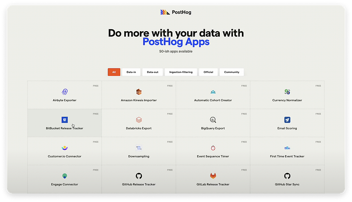
The core functionality can be extended by adding apps from the PostHog library. The everyday “50-ish apps” microcopy creates a sense of familiarity and comfort.
❌ Cons
The UI design strongly resembles Wikipedia. This immediately creates a sense of familiarity but does not help remember PostHog by its branding.
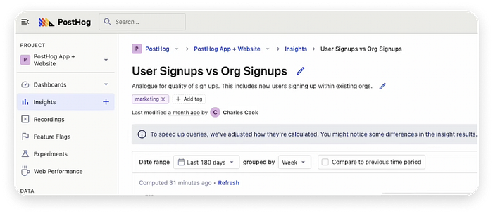
Chart look and feel cannot be customised unless users self-host PostHog.
Discover professional UX design.
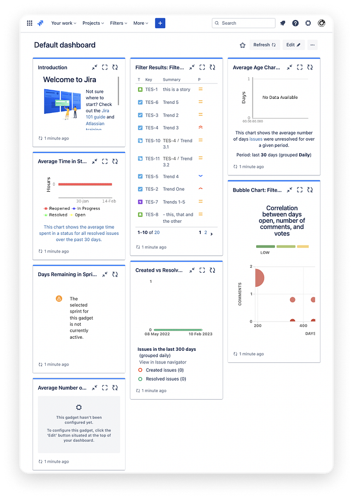
Atlassian Jira
Most people who have worked for a large organisation will have some familiarity with the Atlassian software suite. Jira dashboards have evolved to enable a reasonable degree of customisation.
✅ Pros
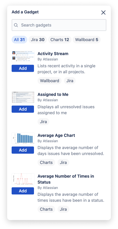
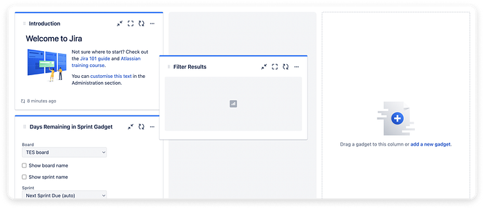
Like most modern dashboards, Jira allows users to select the widgets (or ”gadgets”) they want to use. To find all available gadgets, people can click the “Edit” button at the top of the dashboard screen. The quick filters provided below the search field are helpful.
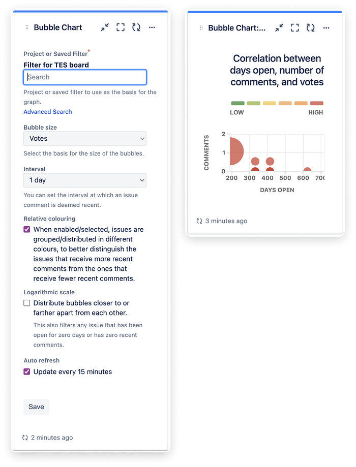
Configuring a gadget in Jira is easy: after filling in the configuration form, the output is immediately displayed and people can go ahead and edit settings until they’re happy with the results. For specific gadgets, the refresh interval is also configurable. Each device also has a manual refresh button in its top-right corner.
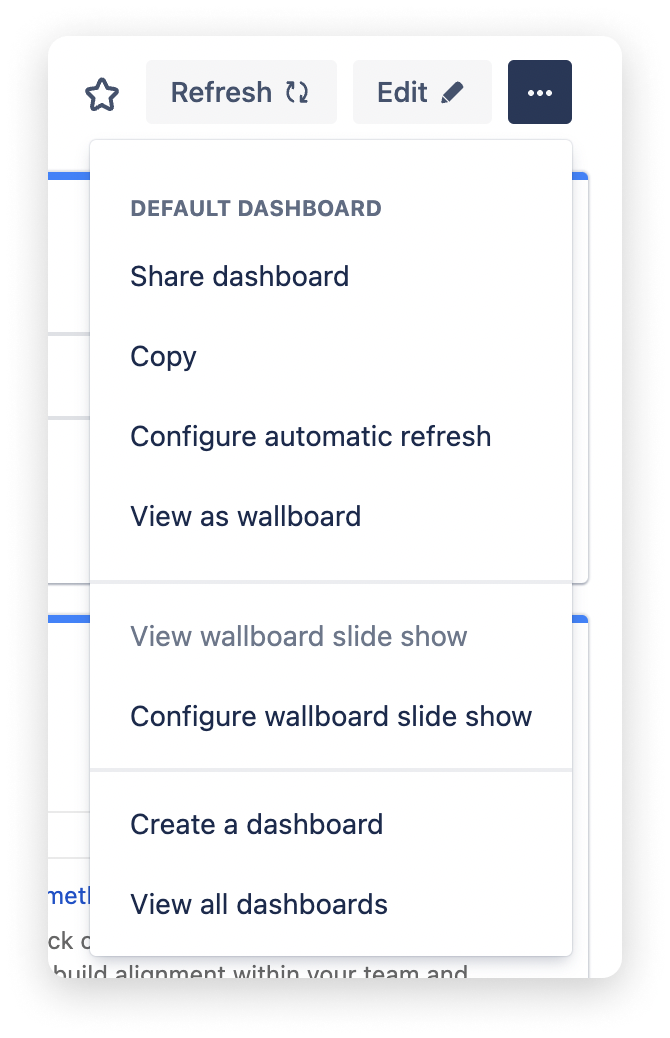
The top-right actions on the Jira dashboard are convenient: in addition to editing gadgets, people can add the current dashboard to their list of favourite views, manually refresh all gadget data and access a list of additional actions, including share and copy functionalities. Even though this makes the top-right corner of the screen more crowded than on other platforms, Jira provides a good balance between essential and nice-to-have features.
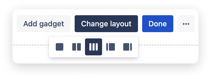
The option to change the dashboard layout is a rarely encountered, nice-to-have feature. Each of the five available layouts can be effective for specific use cases. For example, a project manager might prefer to split their screen into a large left-hand column to track tasks for the current sprint and a narrow right-hand column for small overview gadgets, while an individual contributor might prefer to use equal-width columns or a single-column layout.
Jira might have been one of the first platforms to enable drag-and-drop for rearranging gadgets on its dashboards; nevertheless, it continues to be a useful feature that works just as expected. The grey rectangle clearly indicates the “drop” area in the background.
❌ Cons
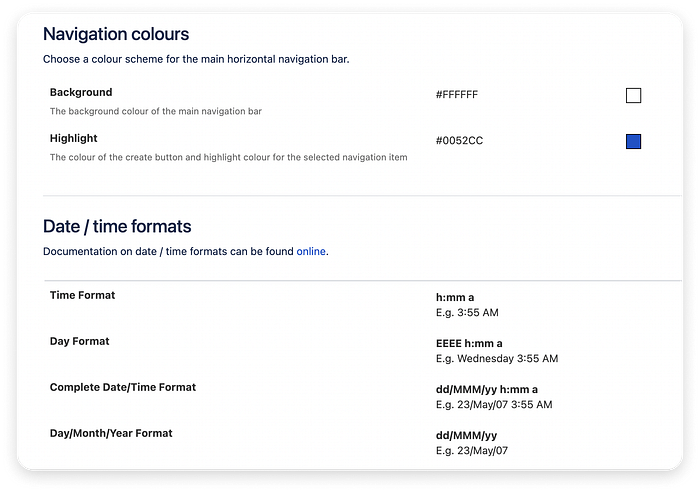
The look and feel of a Jira dashboard can be a bit drab. While standardisation across Atlassian products is suitable for a consistent user experience, the “look and feel” setup area only allows customising the navigation bar colours and date & time format. This is very limited compared to the level of customisation allowed by other platforms.
The UI design of the current gadgets is basic but good enough for productivity and focus. Despite this, header font weights are heavy and can be distracting. Allowing users to customise typography (fonts) could be beneficial.
Jira does not offer an out-of-the-box dark mode. People can use third-party browser extensions for this purpose, but most other platforms allow switching to a dark theme natively.
The experience is not optimised for mobile browsers: the dashboard simply zooms out to fit the default desktop resolution view.
However, Jira has dedicated iOS and Android apps, which users can install if they want to use Jira on the go.
Monday.com
✅ Pros
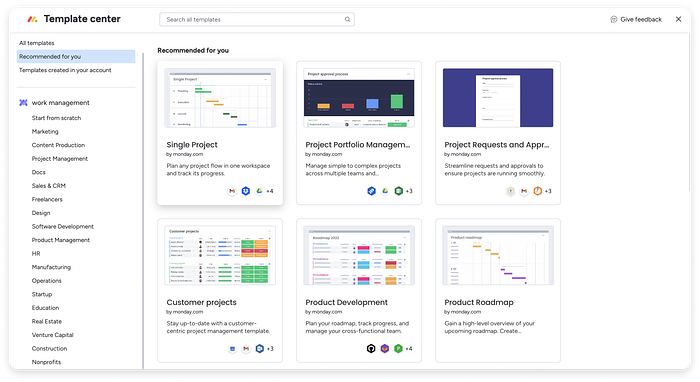
Monday.com does not simply provide a customisable dashboard. Instead, it gives all users on any plan access to a “template center”, where they can search for their particular use case and explore related dashboard templates. This means that complete dashboards can be generated in just a few clicks and adjusted to fit user needs perfectly.
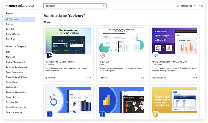
Additionally, the platform integrates an app marketplace containing even more dashboard templates. These are third-party apps that can be purchased individually. Some of them are completely free while others include limited free versions or free trials. Regardless of the type of organisation the user is in, the marketplace likely includes templates that match your daily workflows.
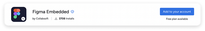
Design teams will even find several apps that enabling them to embed files from their design tool of choice, such as Figma, Sketch or Adobe XD. This plugin is a must-have for an organisation looking for a go-to project tracking platform.
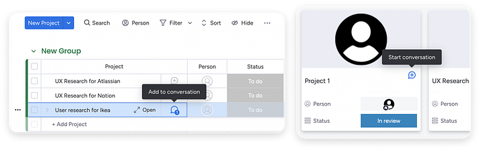
Asynchronous collaboration is encouraged by enabling people to start conversation threads related to each project or individual task. The “Start conversation” or “Add to conversation” button is included by default for each item created on a dashboard.
Monday.com offers integrations with a large selection of popular business software. This can come in handy if your organisation collaborates with companies using other project tracking software and you end up using multiple platforms to achieve the same goals.
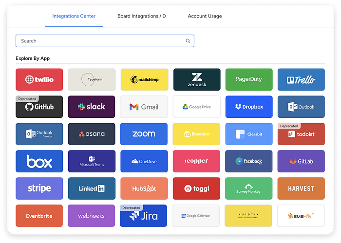
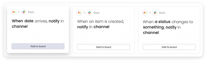
Moreover, each integration contains predefined setups for a whole range of use cases — for example, Slack has over 10 presets. This anticipates user needs and makes the whole experience a matter of clicking through guided user flows.
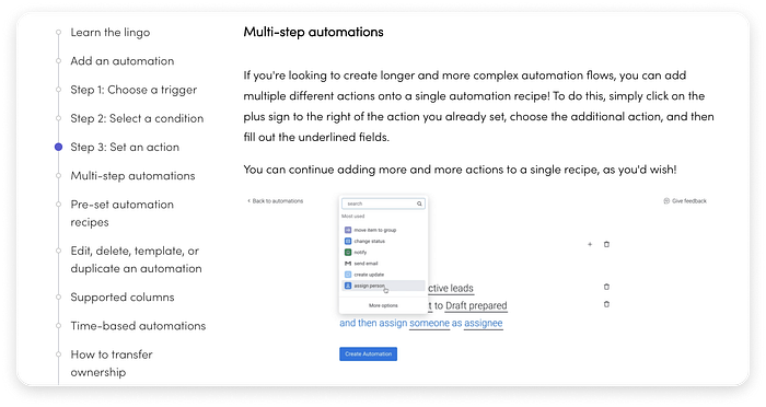
The Help area is very well structured and covers more complex workflows. For example, pro users are empowered to create multi-step automations that can reduce repetitive tasks to a minimum.
❌ Cons
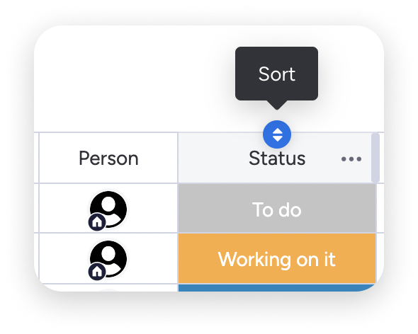
Monday.com seems to to everything, and do everything very well. However, they’re especially fond of displaying certain actions only on hover. For example, the “sort by column” button is revealed when hovering over a column header. This is fine to reduce visual clutter, but bad for anyone using a touchscreen and no mouse; those users will never discover certain important actions unless they switch devices.
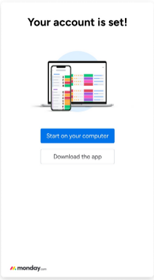
Accessing the dashboard in a mobile browser is not possible; after logging in, users are prompted to download the app or use a desktop device instead. This is a minor downside; daily users are likely to install the app for a seamless experience.
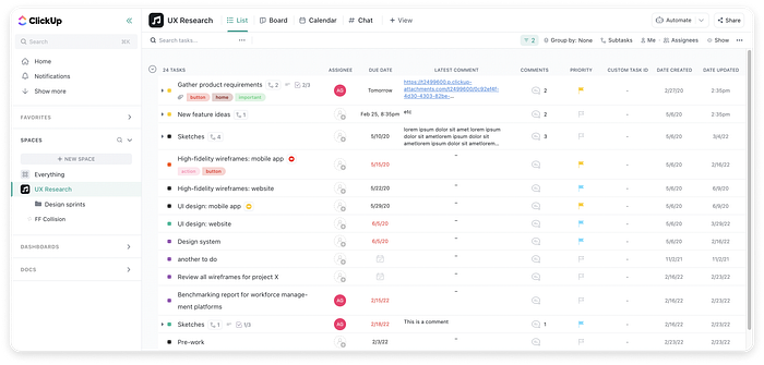
ClickUp
✅ Pros
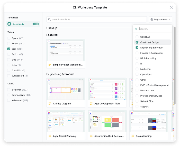
Like all decent project tracking platforms, ClickUp offers a collection of dashboard templates. What sets them apart is the sheer number of templates available, as well as the Beginner to Advanced filter — a nice touch that also allows identifying minimalistic templates.
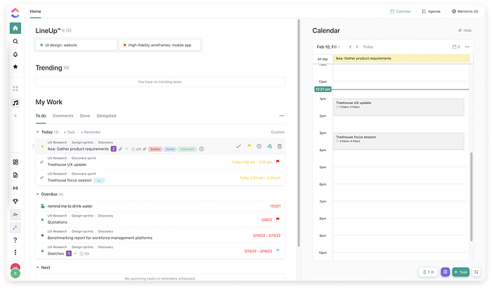
The main dashboard is focused on individual productivity: the top LineUp section is a prioritised set of tasks for the current user, based on ClickUp’s algorithm. The right-hand panel enables people to switch between the day’s schedule and a list of mentions in the team’s async communication on the platform. A nice touch is the delegation feature, that allows people to assign other team members quick action items on the go.
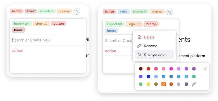
The ability to create and apply custom tags to each item on the dashboard is a nice feature. Tags act as quick filters that enable users to immediately find a set of related tasks or documents in their workspace.
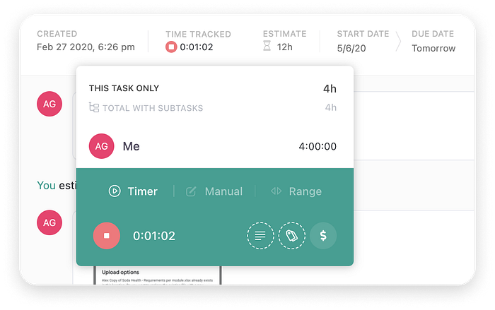
ClickUp offers a complex time-tracking feature, that includes a timer, manual time entry, tagging and marking billable hours per project.
Users can enter time estimates for every task and afterwards compare estimated and tracked time. Time tracking is not usually provided as a core feature by competitor platforms.
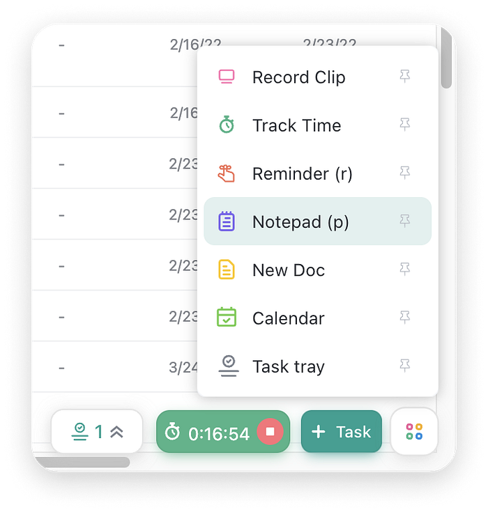
The bottom right corner of the dashboard contains some interesting features:
- a task tray that links to items with a tight deadline.
- an active timer component, if time tracking is running.
- a “new task” button.
- a collection of shortcuts that people can choose to pin to the bottom corner, as needed.
This bottom component cluster is unique to ClickUp and can potentially become the reason for people sticking with the platform.
In addition to “classic” list, board and calendar views, ClickUp offers a very extensive set of less typical views, that can be activated for any dashboard:
- Chat: in this view, a project team can have an asynchronous conversation about tasks, create ad-hoc to do lists and reassign work as needed
- Whiteboard: a basic flowchart and sketching tool, with a limited set of templates
- Workload: a resource management view that helps project managers and planners gain a better perspective on team capacity
- Timeline and Gantt views: specialised planning views that allow spotting overlaps and marking blockers
- Embed: a view that enables embedding other software to save time and reduce context switching
- a whole range of other options that might prove relevant depending on the organisation and project.

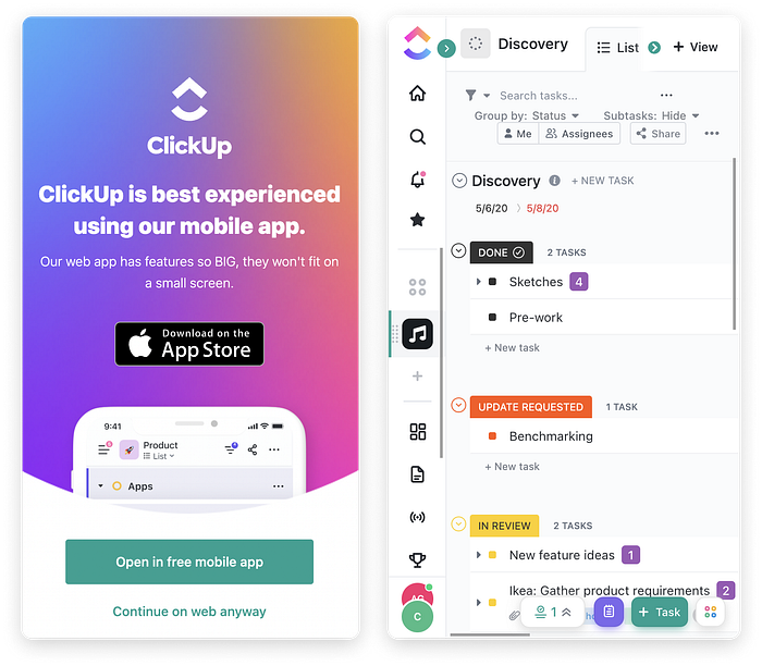
When trying to log in on mobile browsers, users are nudged to install the app. We appreciate the fact that ClickUp provides a "Continue on web anyway" secondary action. This offers a needed alternative for people who are in a hurry, do not want to download the app or are using another device.
The mobile web experience is acceptable but still has flaws. Swiping or pinching to zoom out is required to explore the entire dashboard.
❌ Cons
The default layout for both list and card views is extremely compact and the small font size is likely to affect legibility; this is good for a quick overview over a large project, but at a first glance it makes the dashboard seem overly difficult to scan.
This is mitigated by a layout setting that enables people to increase paddings between interface elements, but the setting is not easy to discover.
At the bottom of the navigation sidebar, the organisation avatar seems to overlap the user avatar by mistake. In reality, ClickUp meant this to be a single button that opens the account menu. A single circular button would look a lot clearer than the overlapping ellipses.
Semrush
Semrush is an all-in-one SEO and marketing insights platform.
✅ Pros
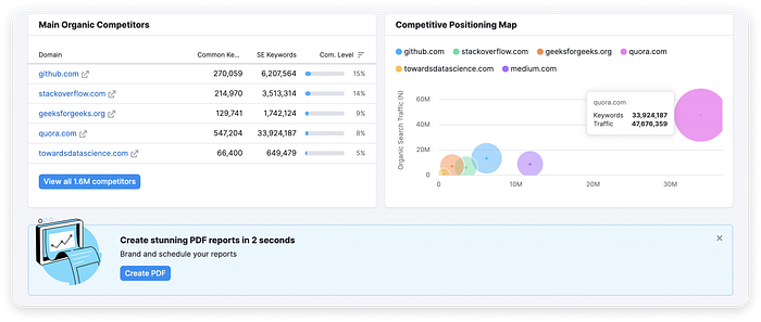
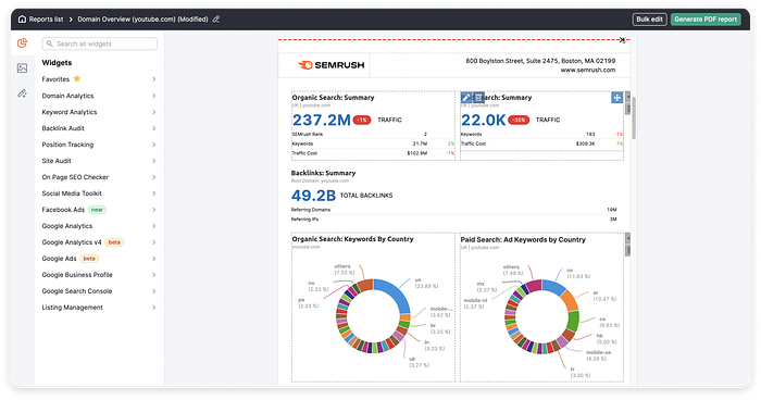
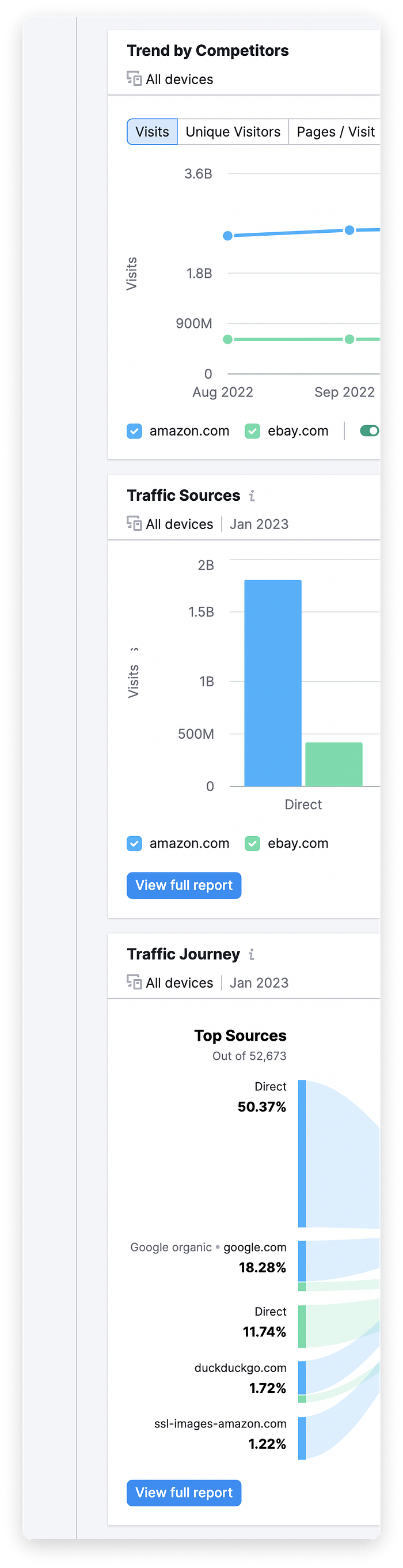
Semrush provides multiple data dashboards with extremely rich data to help marketing departments get in-depth insights on all aspects of customer interaction with a particular brand. On the domain overview dashboard, users can see domain analytics for any domain name in addition to their own; this is a valuable tool to quickly gather insights on what others are doing better or more of.
Clicking any statistics or visuals on the dashboard drills down into more detailed information. For example, users can see a full list of keywords sorted by position in organic search results for a given domain.
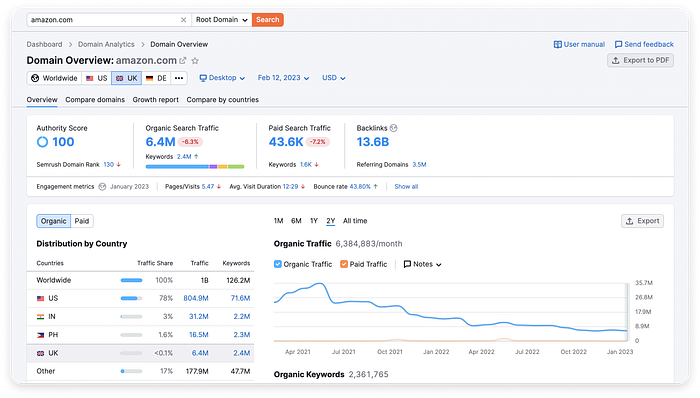
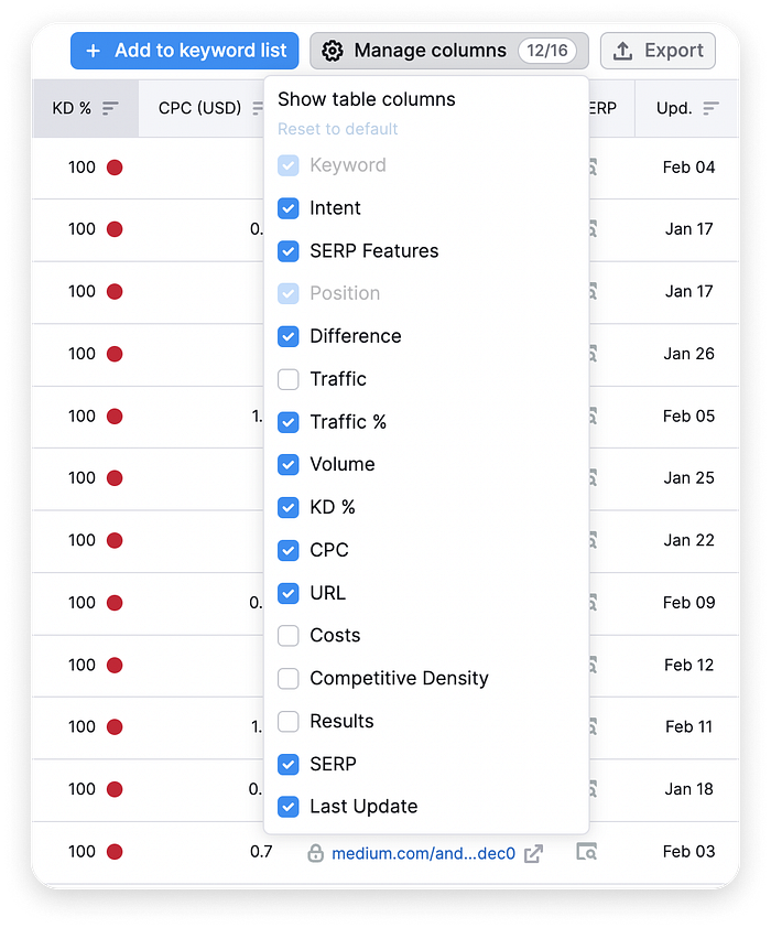
In all insight tables, people can go ahead and sort data by clicking any column header.
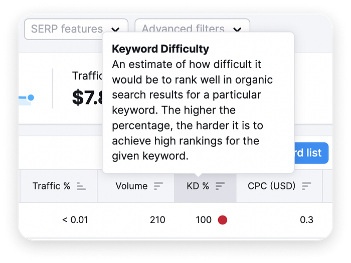
Hovering over elements on the page often reveals tooltips to explain industry lingo.
Widgets are generally laid out on a 2-column layout, that provides enough space for visualisations and small tables. Tooltips are non-intrusive and provide just the right amount of extra information on chart data. We like the suggested action banner at the bottom of the dashboard: beside guiding users towards functionality they might have not known of, it can also be removed in a single click.
A whole slot of the dashboard encourages people to suggest new widgets. The input field is small enough to encourage users to start typing even if they don’t have a well-defined idea, but conveniently adapts in height as a longer message is typed.
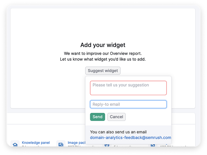
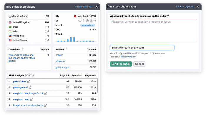
Moreover, a “Need more info?” button is included in context and navigates to a small suggestion form. This gives the sense of intense user focus and preoccupation with continuous improvement of the user experience.
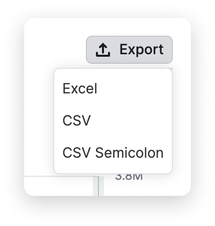
Individual charts and data tables can be exported as Excel or CSV files via the top-right Export button.
Furthermore, the entire dashboard can be exported as a PDF file or shared as a web page. As an advanced feature, users can create their own custom PDF reports based on the Semrush template. Within the PDF template, they can search for and insert widgets via the left panel. This level of customisation can only be found on large, firmly established platforms.
Each user can choose the exact data they want to see inside a widget via the “Manage columns” drop-down menu. Once manual selections have been made, the “Reset to default” button becomes active.
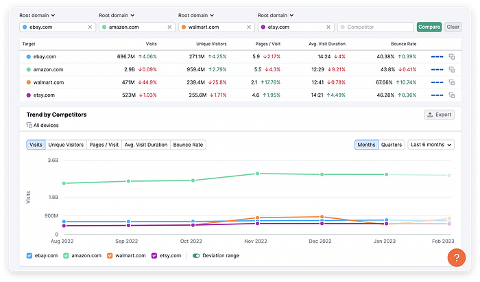
The UI design style is clean and unobtrusive. When multiple entities need to be distinguished easily, such as in the competitor analysis view, each entity is automatically assigned a high-contrast colour, displayed as a dot on the left of the entity name and applied to all related values below. The colour scheme works well and gives the platform an up-to-date feel.
❌ Cons
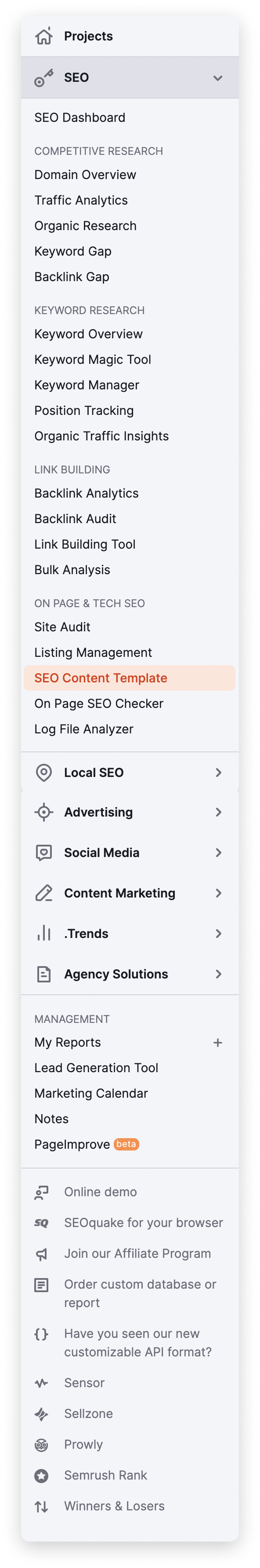
The only real downside we see with Semrush is the sheer size of the side navigation menu. Even though only one main section can be expanded at a time, the number of pages visible is still overwhelming. People are unlikely to ever make the time to explore everything available on the platform.
This is a typical weak spot for all-in-one tools. Some solutions to simplify navigation could be hiding extra functionality inside modules that people could activate as needed, or enabling each user to manually edit the side panel. However, in both cases, discoverability would be affected.
The user experience is not optimised on mobile web; swiping left and right is needed to fully view graphs on any dashboard. Like many mature platforms, Semrush has its own mobile app, which explains why they have not perfected the mobile browser UX.
Mixpanel
✅ Pros
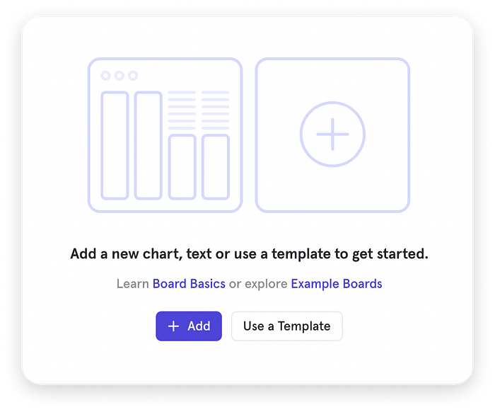
The Mixpanel dashboard starts off as a blank slate, but includes two calls to action: adding a widget manually or starting from a template. This gives people the opportunity to craft their dashboard with care, rather than starting off from a cluttered view that might distract them.
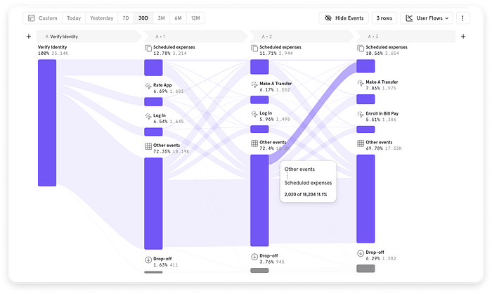
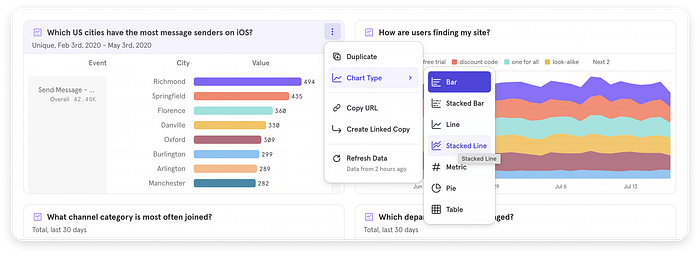
Mixpanel provides a good variety of chart types for most business cases. For example, users can generate a Sankey diagram that covers multiple user flows for a personal finance app. This is an interesting way of visualising user flows, and the fact that it has been generated in just a couple of clicks is remarkable.
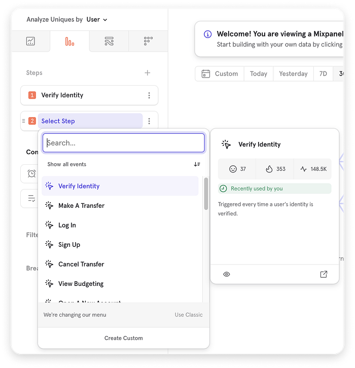
The data structure behind each visualisation can be customised via a left-hand panel. Users are properly guided by numbered steps. Even though customisation features seem endless, the interface is clear and makes for a seamless experience.
We like the fact that the navigation sidebar is expanded by default; this supports learnability and gives people an overview of their dashboards. The ability to drag the edge of the sidebar to increase its width or collapse it is also a nice-to-have feature. Users are given full control over the amount of screen they want to dedicate to the board sidebar. This supports both people who are going to work with a single dashboard, and those who need to create dozens and switch between them often.
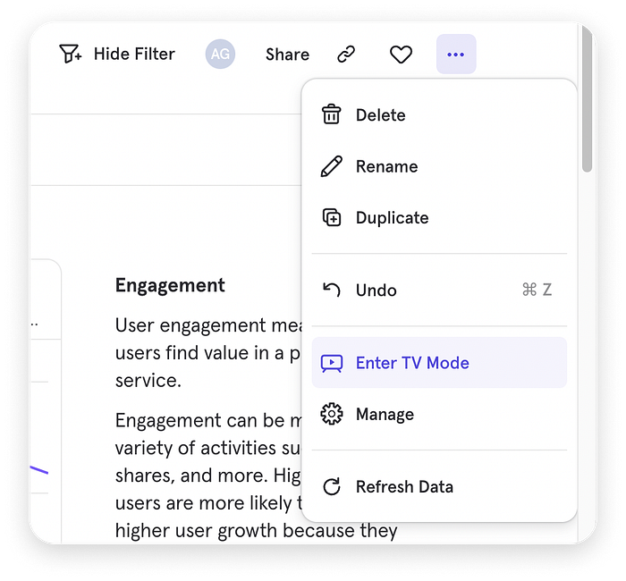
The top-right corner of the dashboard provides a set of familiar functionalities such as filtering, sharing and adding the current board to a list of favourites, but also interesting options like entering a TV mode.
This mode effectively hides the side and top navigation menus and supports people who want to present charts to others without any distractions. Additionally, it can help quickly hide confidential information when presenting charts to a customer.
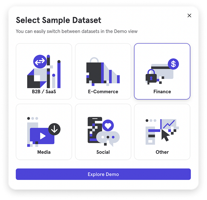
Those who are on the fence about using the platform have two options: watch an in-depth webinar or test features in a sandbox. Multiple test datasets are available. This helps reduce friction and gently push people along the conversion funnel. Moreover, the free plan is atypically generous, covering all the usage a small organisation will probably need.
🌤Mixed Feelings
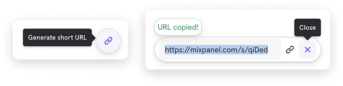
The bottom-right floating button is an interesting way of making sharing effortless. Clicking it automatically copies the URL to the dashboard.
Nonetheless, we can’t help but notice that the “Generate short URL” tooltip is slightly misaligned. Moreover, the location of the floating button is typically reserved for “Contact Us” plugins, which could make people miss this feature altogether.
❌ Cons
While people can choose the type of chart they want to see in each widget, the colour palette is not customisable. The overall aesthetic of the platform are excellent, chart types that use more than 4 colours can look a bit coarse. This could be solved by adding at least another colour theme for people to optionally switch to — for example, an analogous colour scheme.
In mobile browsers, the dashboard is not responsive. The view is zoomed out and visualisations cannot be interpreted unless users zoom in on them one by one.
Databox
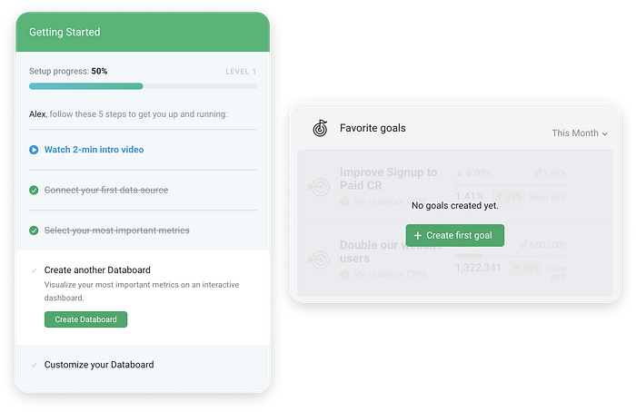
✅ Pros
Onboarding is straightforward. The “Getting Started” side panel indicates setup by a progress bar and lists completed and remaining steps. Dashboard widgets also guide users towards the actions they need to take to populate the space. Calls to action are clear and consistent.
Novice users have multiple options when it comes to learning how to use a specific feature:
- watching a demo video,
- reading a help article,
- scheduling a call with a Databox representative,
- or jumping right in and figuring out how to set up the platform on the go.
Datasets can be imported from a large collection of popular sources, including:
- Google Sheets, Google Analytics, Microsoft Excel files, SQL databases, marketing automation and social media platforms.
The user flow is laid out at the top of the import screen.
❌ Cons
The brand colour palette is not distinctive enough to be memorable; the accent blue looks muted and therefore fails to grab attention to what needs to be done next. The user interface generally lacks unique, delightful touches that could draw people in.
Even though Databox follows rules of thumb, such as guiding users towards specific goals and providing walkthrough tooltips to new users, the UI looks dated and in need of input from an accessibility expert. For example, the transparent white font on a blue tooltip background does not meet WCAG 2 accessibility guidelines.
Colours are used inconsistently across the UI; for example, on blue tooltip backgrounds, both white and black are used for text and graphic elements. This probably derives from an uncertainty about proper contrasts between background and foreground elements.
Databox does not provide a sandbox; to test the platform, people need to import and configure their own datasets.
Mailchimp
✅ Pros
Depending on the use case, a minimalistic dashboard can bring more value than a more traditional, chart-focused tool. The Mailchimp dashboard provides quick stats on current marketing campaigns and audience changes. While they could have gone for a basic chart, they’re instead drawing attention to the recommended action described in the top half of the screen. This different approach caters to their target audience.
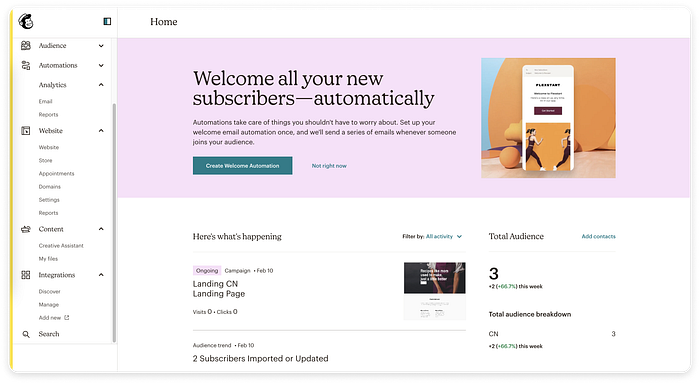
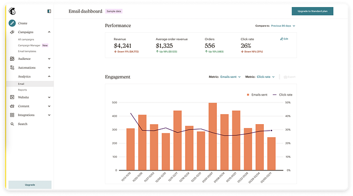
Dashboards in the Analytics area also provide basic visualisations. Performance metrics are highlighted at the top, while the chart includes basic filters and an export option for paid plans.
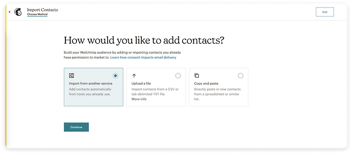
The data import flow takes place in a full-screen modal window, to eliminate any distractions. The card options are simple and effective; radio buttons are an optional affordance, while the top-left icons add a nice visual touch.
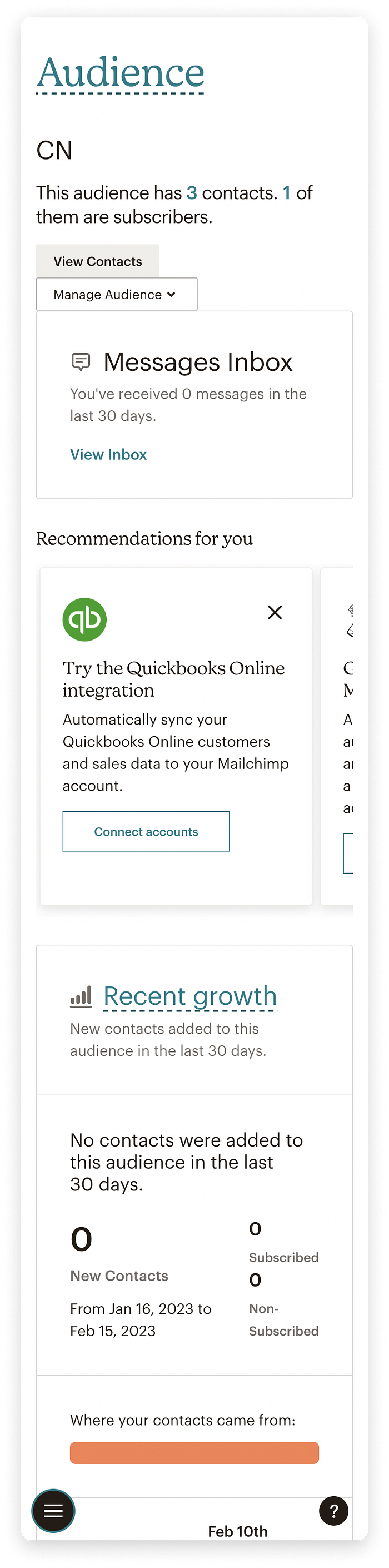
Even though it has a mobile app, Mailchimp responsiveness is well-implemented for mobile web use. Dashboard widgets adapt to small screen sizes and provide a great experience. An interesting choice is the bottom-left location of the hamburger icon; typically, menus collapse into top hamburger icons instead. However, Mailchimp has chosen this button location to optimise single-handed usability. Moreover, the high-contrast button is hard to miss.
❌ Cons
Mailchimp offers almost no customisation in terms of dashboard layout, look and feel. However, this UX choice makes sense to us, as the platform is clearly aimed at a target audience that is not likely to sink time into customising the interface.
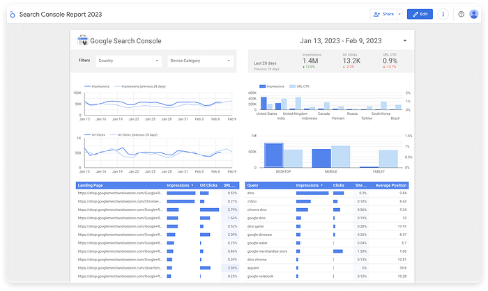
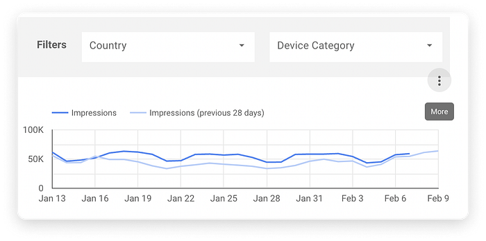
Looker Studio
Part of the Google Analytics 360 suite, Looker Studio is a free tool that enables creating dashboard and reports based on imported datasets.
✅ Pros
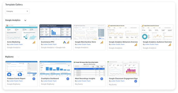
People can start off from a template and test all features before deciding if this is the right tool for their needs. Any template can be duplicated and freely edited.
A Google account can be used for accessing this data dashboard. The user can log into Google and be ready to start working on the dashboard. Sharing dashboards with other Google users and setting up permissions for them is also as easy as sharing documents on Google Drive.
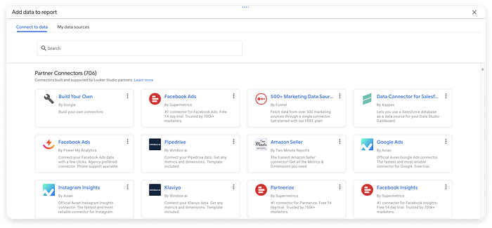
Importing data into a dashboard is a strong point for this tool, with thousands of sources available and instant access to one’s Google Drive documents.
Importing data into a dashboard is a strong point for this tool, with thousands of sources available and instant access to one's Google Drive documents.
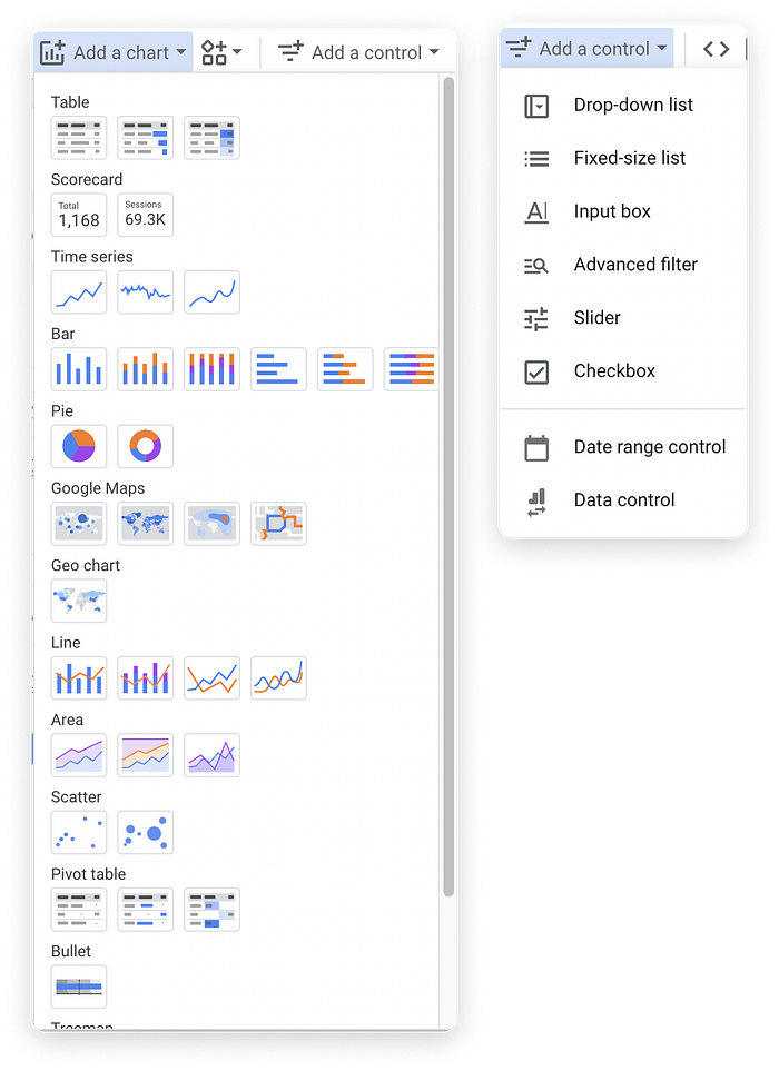
In addition to a decent number of chart types, users can insert and set up specific controls, such as drop-down lists and advanced filters, wherever they want on their dashboard.
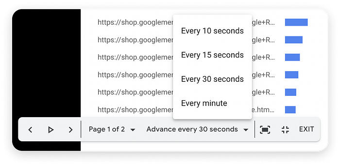
Users can switch their dashboard to a presentation mode and optionally have slides advancing automatically at a set interval. This is a nice-to-have feature, but definitely not essential for a data dashboard
Any data can be exported in multiple formats. Nonetheless, PDF would have been a useful option.

❌ Cons
If you don’t happen to be a fan of the Material Design language, the boxy UI design of this data dashboard will quickly become frustrating.
The layout of the templates is rather crowded, with large margins, but small and uneven paddings within chart components.
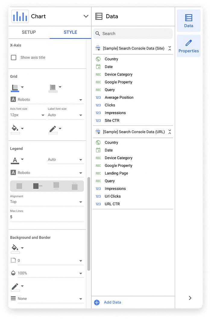
Look and feel customisations are quite extensive; however, they are hidden in a “Properties” panel, which is not an intuitive name for UI customisations. The style panel itself could benefit from larger paddings; settings seem to run into each other and this makes it difficult to locate specific items.
On hover, the “More” button above a chart partially overlaps the section above it, that it has no connection to.
This is a UX design oversight in the available templates. Users can manually move sections away from each other to solve this issue, but the initial look gives the sense of rushed & unpolished.
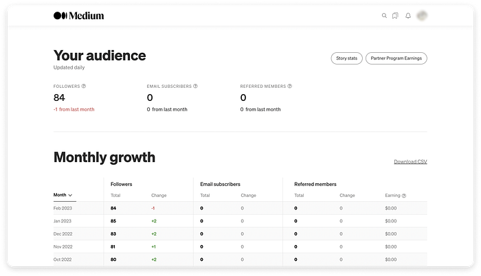
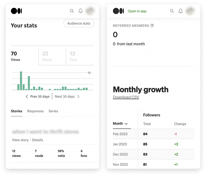
Medium
✅ Pros
Medium provides two very basic dashboards for publishers, to cover article and audience statistics. The minimalistic layout of the dashboards matches the overall platform style. View stats per month are represented on a non-customisable bar chart. Users can also check out views and likes on their replies to articles.
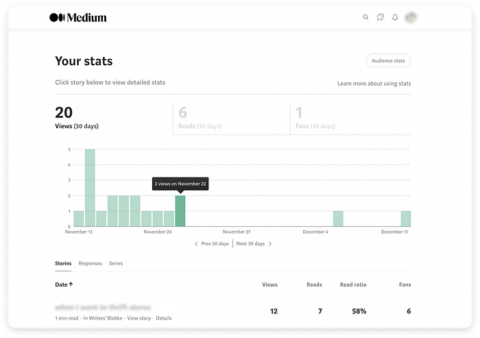
Audience growth statistics can be exported as a CSV file.
The dashboard layout is responsive; the switch from desktop to mobile browsers feels perfectly smooth, especially since these dashboards are not cluttered with many types of widgets.
❌ Cons
Medium offers no customisation features on the publisher dashboards. Moreover, the layout of the two dashboards is inconsistent — starting from the different weight of the heading font on each.
In the information architecture, the audience dashboard is a subpage of the article stats dashboard; it seems to have been added as an afterthought, hence the UI inconsistencies.
No filters are available; a date range filter would be essential for people who frequently publish on the platform.
Pinpoint
✅ Pros
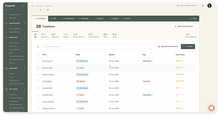
Pinpoint has one of the most refined user interfaces among applicant tracking software we have come across. Its main dashboard provides a clean overview of current openings and their respective application funnel. Basic bar and doughnut charts are also included, but given a secondary role on this dashboard.
The earthy colour palette with subtle shades of green, yellow and orange makes the brand instantly recognisable. The colour scheme evokes a sense of soothing calm and comfort; the muted tones add a layer of sophistication to the brand’s visual identity.
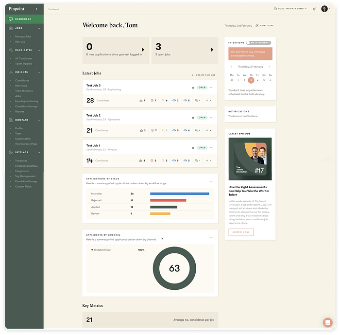
The layout is also a strong point: the wide main column provides the main insights, while the narrow right-hand column includes calendar and notification widgets and a link to the company’s podcast. The large margins are appropriate for the amount of content provided and direct attention towards the main content column.
The navigation sidebar is expanded by default, but can be collapsed to reduce distractions. Navigation items are unobtrusive, and the structure of sections is intuitive.
In-page navigation is relatively complex, with certain pages containing many tabs. However, the UX design is optimised to guide users from right to left, in a natural progression toward hiring the right candidate.
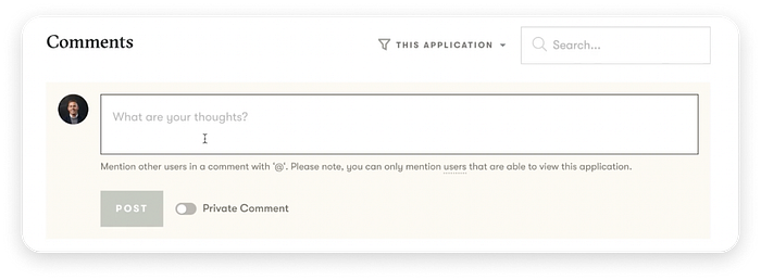
Among asynchronous communication features, we like the “private comment” toggle. This restricts access to the comment to the person posting it and any people tagged within it.
❌ Cons
There is no way to add extra charts to the dashboard, rearrange widgets or customise the look and feel of the dashboard. What you see is what you get — the focus is placed on usability and optimising the speed of recruitment workflows.
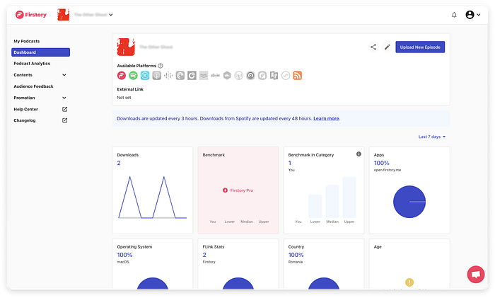
Firstory
Firstory enables anyone to start their own podcast and monetise it.
✅ Pros
The dashboard layout makes efficient use of space, with 12 equal-sized, nearly square widgets providing all available statistics. The time range filter contains a few predefined “Last x days” options but also allows selecting a custom range that can span from a few days to many years.
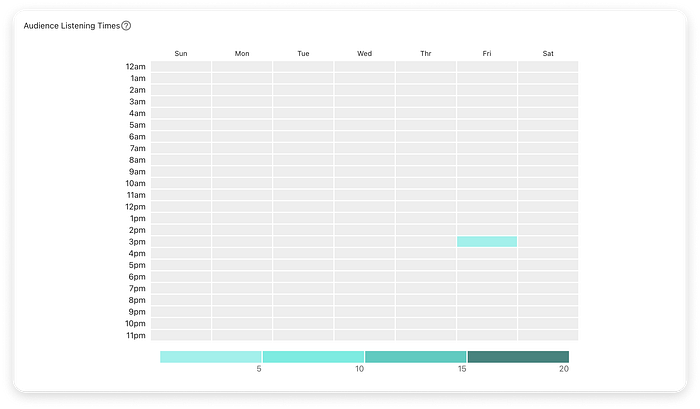
People can click each widget to dig into more detailed stats; for example, they can discover the most popular listening times to make informed decisions about when to publish new episodes of their podcast.
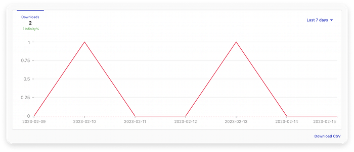
Certain stats can be exported as CSV files via a small button below the related chart.
Users can select one of the preset themes or create a custom theme for their podcast interface. This feature is only available on the paid plan.

❌ Cons
The Firstory dashboard cannot be customised. The default set of widgets is always active for everyone; only one filter is available. Nonetheless, this is a new platform — more customisation might be added following user requests.
Must-have Features
Importing Data
The ability to import data is essential for organisations to start using a new visualisation tool. When considering a new platform, most users will already have a large dataset they want to manipulate. Making it painless to import it is a must for modern dashboards.
Choice of Chart Type
An obvious feature that most dashboard users will look for is the ability to choose chart types for each dataset visualised. The available dataset impacts the range of options to some extent; great platforms will also provide guidance on applicable chart types.
Filters
- People should be able to filter data according to their needs to find the most relevant information for their current activities. There are endless approaches to filter UX — what’s essential is to provide at least a basic way of filtering data on a dashboard.
- Most often, to discover trends and changes in data over time, people need a time period filter. This filter could be a basic set of predefined values or a more advanced flavour that allows selecting start dates and times as needed.
Real-Time Data
- For many organisations, accessing real-time data multiple times per day is essential, as it allows people to make timely and informed decisions. Many dashboard tools allow users to choose the rate of refresh for data.
Collaboration Features
- The ability to share a dashboard view with colleagues or collaborators is a must. In addition, users should be able to set up permission levels for each person they invite for collaboration (view only, edit, copy, share with others etc.). Related features include commenting and attaching files to a dashboard — nonetheless, these are non-essential for many organisations.
Clean Layout
- When working with large amounts of data, people need close guidance and minimal distractions to be able to process information efficiently. The default layout provided by a data visualisation platform needs to be clean and minimal, to help people focus on charts and insights. Too many buttons and extra options can hinder understanding and ultimately drive people away.
Free Trial
- Access to a free trial is very likely to attract people who are on the fence about which tool to go for. Free trials reduce friction and give people a clear idea of how easy the dashboard is to use and how many relevant features it provides out-of-the-box.
- By contrast, platforms that only provide the option to sign up for a live demo add a lot of friction to the user experience. Scheduling a demo means blocking a specific time slot, connecting to a specific meeting platform on time and often answering a lot of questions on one’s use case from the person or team providing the demo.
Documentation
- Help content can come in many shapes and sizes, from dedicated documentation portals to “how to” tooltips provided in context, walkthrough pop-ups, basic text paragraphs next to interactive components on the interface, videos or even PDFs and PowerPoint slides. Really great platforms provide unobtrusive, just-in-time guidance (quality over quantity).
Nice-to-Have Features
Responsive Design
- A must for any up-to-date platform, responsive design can prove rather tricky for complex data dashboards, where people need to drill into highly detailed metrics. We’ve listed this in the “nice to have” category, as many web dashboard tools nudge people towards a dedicated mobile app instead of optimising their mobile browser experience.
Custom Layout
Most dashboard platforms allow customising the layout of the main dashboard screen to some extent. Customisation features include:
- displaying or hiding widgets from a predefined set;
- rearranging widgets via drag-and-drop gestures or by clicking dedicated arrow buttons;
- selecting a UI theme from a set;
- customising colours and fonts;
- changing widget sizes and proportions.
Export Options
- Allowing users to export content from dashboards is strongly dependent on an organisation’s security guidelines. However, when allowed, it is a good idea to provide at least two export formats: a read-only option such as PDF or a popular image format, and a “raw data” option.
Duplication
- More complex platforms enable users to create dashboard duplicates; this is useful for organisations that need to create a separate dashboard for each project or collaboration, and want to start from a core template. Additionally, some platforms allow duplicating a widget on the current dashboard.
Common UX Challenges
The following challenges are not unique to data dashboards, but they can affect user experience on dashboards in specific ways:
Learnability:
- Getting people up to speed with operating the dashboard efficiently as soon as possible.
- Learnability is an issue with any tool that provides high levels of complexity.
Usability:
- If a new system requires a significant investment of time or seems like it might, it is less likely to be used.
- This can become an issue on dashboards if the initial setup is not straightforward and less tech-savvy users get stuck.
Memorability:
- The ease of remembering how to use a certain system.
- If the actions required to customise the dashboard or a dashboard widget are difficult to memorise, people are likely to never edit their initial setup, even if they’re not happy with it.
Efficiency:
- The effort and time required to learn the tool must appear reasonable to new users.
The onboarding experience is key:
- Dashboard platforms that provide a guided setup experience attract more users in the long run.
Desirability:
- People must want to learn and use the new tool in their daily activities.
UI design can make or break a new platform.
Data Dashboards are essential in most fields of work. When it comes to the medical sectors, EHR & EPR systems are in use.
Fortunately Creative Navy has also covered these solutions.
